Everything you need to know about using tiles as a design tool

Interior designer Lesley Taylor, founder of Baked Tiles, on how tile layout, trim and grout can be used as design tools, not just finishing touches.
Last updated: September 11, 2026
“There's one design element in almost every home with real power to elevate a space - and most people leave the details to their tradesperson without a second thought.“
As an interior designer with 30 years' experience, and founder of Baked Tiles, I've spent my career watching people treat tile choice as a colour-and-pattern decision, then hand the layout over to whoever's doing the work. But tiles aren't just a finish - they're a design tool.
Get the layout right and you can add height to a room, zone an open-plan space, even correct proportional problems, all before you've spent a penny on anything else. Here's everything you need to think through before your tiler picks up a trowel.
1. Tiles can make a ceiling look higher
Height is an illusion you can design for. Vertical lines pull the eye upward, so an elongated tile format - think long, narrow rectangles - laid with the length running vertically will read as taller than the same wall in a square tile. That said, stripe layouts using two or more colours or textures can have the same effect.
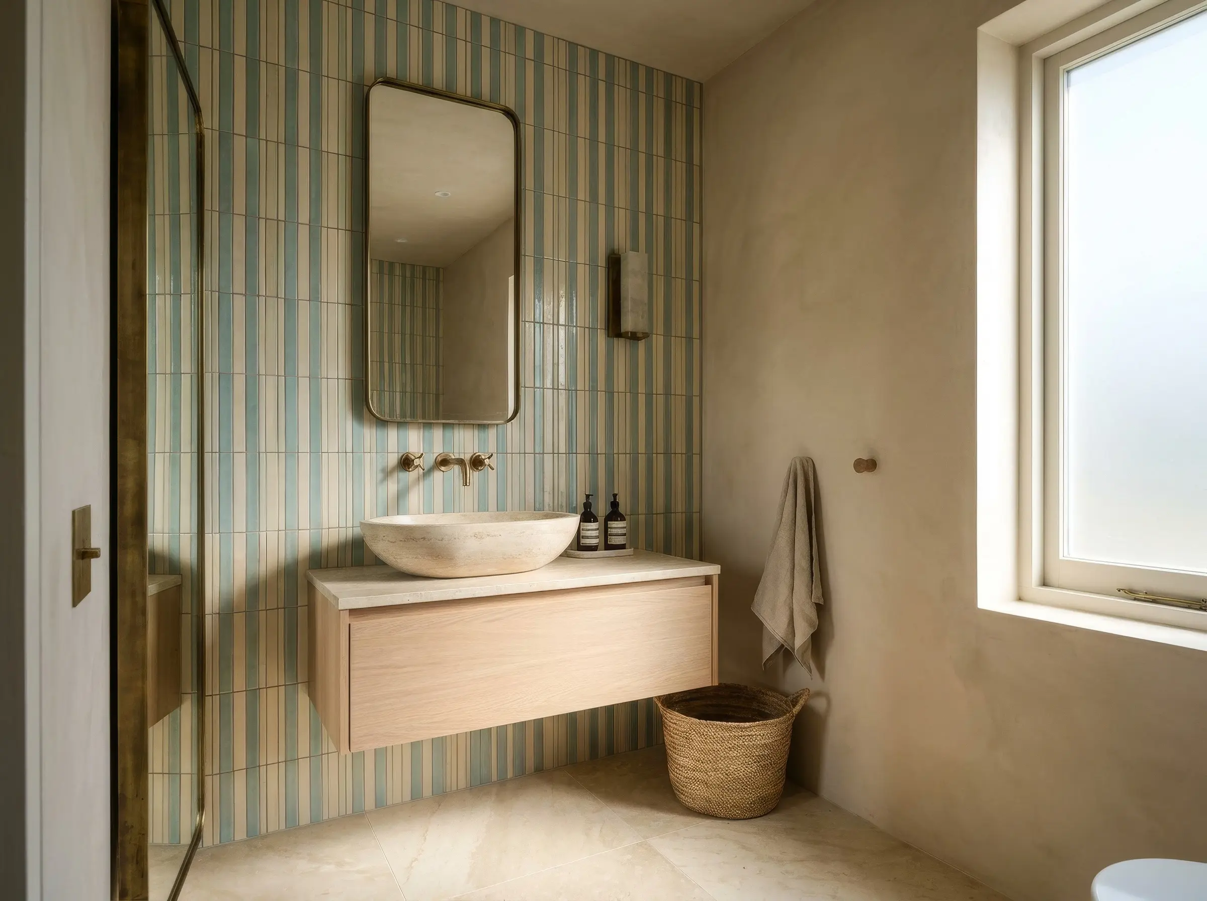
Where you stop the tile matters just as much as the tile itself. Carrying tiling right up to the ceiling (rather than stopping at a dado or mid-wall height) removes the visual “cut-off” point. And grout lines follow the same logic as the tile shape: vertical contrasting grout emphasis stretches a wall upward, horizontal grout emphasis will do the opposite, even in the same tile.
If height is your goal: think about elongated formats, plan for full-height tiling where the budget allows, and specify vertical laying direction - don't leave this to be decided on site.
2. You can zone open-plan spaces with tiles
Open-plan living is popular for a reason, but without any visual structure it can feel like one undefined space rather than a considered layout. Tiles are one of the simplest ways to solve this without adding walls. A change in tile, a change in size, or a change in laying pattern can quietly signal “kitchen ends here, living space starts here” - the eye reads the shift even if no one consciously notices it.
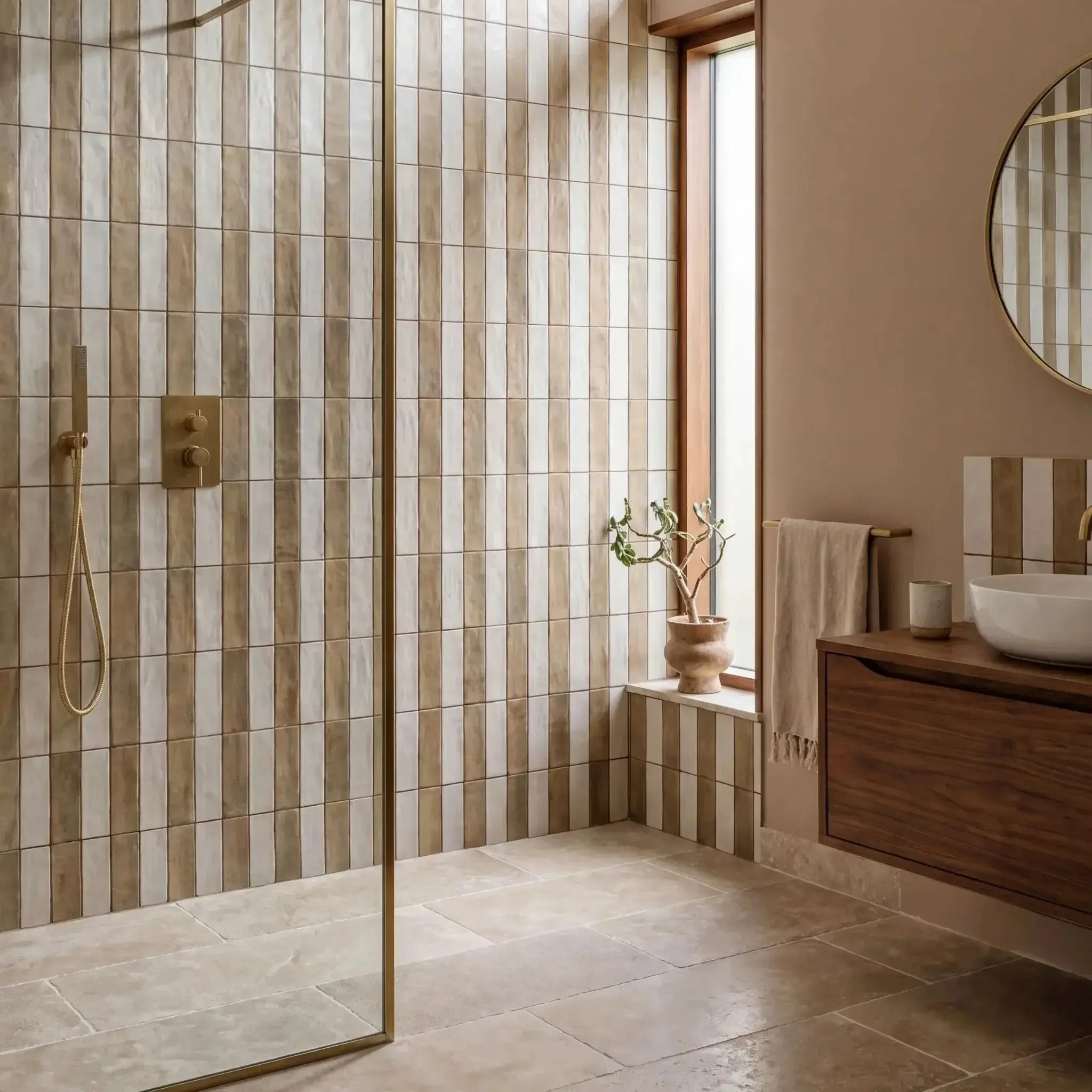
"Haven Matt" from Baked Tiles
How you handle the transition between the two matters: a clean, straight join line reads as intentional, while an awkward or uneven line reads as a mistake. Inset trims can also mark the boundary if you want the zoning more pronounced.
If zoning is your goal: you will need to consider the furniture layout before tiling begins, and brief your tiler on exactly where that line falls and how it should be finished - this is not a decision to make on the day. Consider adding contrast or pattern under island units or dining tables and always consider how the various tiles will sit next to each other. Joint line intersections need to look intentional and if they don't match up perfectly, consider changing tile direction, or shifting the joint until it all looks considered.
A word of warning here: many first-time renovators think a tile sold as a 60x60cm size will be the same size as a tile from another company, but that is rarely the case. Tiles can alter batch to batch and range to range - one tile sold at 60cm could be 59.5 x 59.5cm, another 60.1 x 60.1cm. That is not unusual or a fault, it's the norm within the industry, so check the exact size with your supplier, explaining you want them to line up with other tiles. They should understand - if not, that supplier is used to selling tiles as a commodity and not a design product.
Another cautionary note: tiles that are non-rectified (rectified tiles go through a second cutting process and therefore come in a specific manufactured size) are subject to a natural tolerance in size, but you can actually allow for this within your joint width. So if, for example, you are creating a checkerboard with two colours of a non-rectified tile, then your tiler should be made aware that they may be slightly different sizes, but with careful setting out and spacing by eye rather than with spacer pegs, a perfectly beautiful installation can be achieved.
“I have seen many tilers push back on this, but with years of experience as a designer - plus my dad started importing and selling tiles back in the 60s - I can tell you to stand your ground, as it will 100% work if he is prepared to put in the effort.“
3. Tile trim - what it is, and why it should (usually) disappear
Trim is the strip that finishes a tiled edge - at an external corner, around a niche, or at the edge of a tiled area - so no cut or unglazed tile edges can be seen. Functionally, it protects the edge and helps waterproof the join. Visually, though, the goal is almost always for trim to disappear.
A trim that matches as close as possible to the tile in colour and finish blends into the surface, so the eye reads one continuous plane rather than a tiled area with a visible edge. This is what makes a tiled feature look considered rather than assembled.
The exception is when you want to highlight an edge deliberately - a contrast trim can frame a niche, mark a change of material, or add a decorative line as a design choice.
“The key word is ‘deliberate’. A visible trim should be a decision, not a default. Many tilers' default is to match the tap finish, or opt for simple chrome, but whilst they might think it will look great as it ties into the room, all you actually do is defuse the impact of your beautiful and often expensive brassware, as your eye is also drawn to the tile trim of the same colour and your taps etc are no longer centre of attention.“
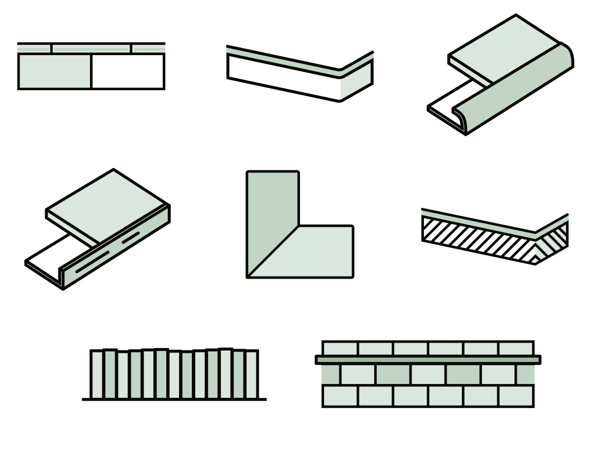
If you want a seamless finish: specify a trim that matches your tile colour and finish. If you want a highlighted detail: choose your contrast trim on purpose, and make sure your tiler knows it's intentional. I will often use multiple trim choices within a room, each one to blend with and fit the depth of the various tiles I use within a design.
4. Grout - the underrated design decision
Grout colour changes how a tile reads more than almost anything else in the specification. A grout that closely matches the tile blends the joints away, so the tile reads as a more continuous surface and any pattern in the tile itself takes centre stage. A grout that contrasts with the tile does the opposite - it makes every joint visible, turning the layout itself into part of the pattern.
Grout width plays into this too. A narrow grout line with a matching colour will almost disappear. A wider grout line, or a contrasting colour, will make the grid of the layout a visible, deliberate feature. Really consider the detailing in the style of room you are trying to create - more rustic interior schemes can benefit from wider joints, as they add a more artisanal feel to a surface.
A designer can use one tile with different grout widths and colours to create totally different looks - yes, it's that really small detail of grout width and colour that can transform and elevate the look and feel of a tile. Ask yourself: do you want the tile's pattern to be the star, or do you want the shape of the tile to be highlighted? If it's the pattern, match the background of the tile; if it's the shape, contrasting grout will highlight its interesting shape.
5. The layout decision nobody talks about
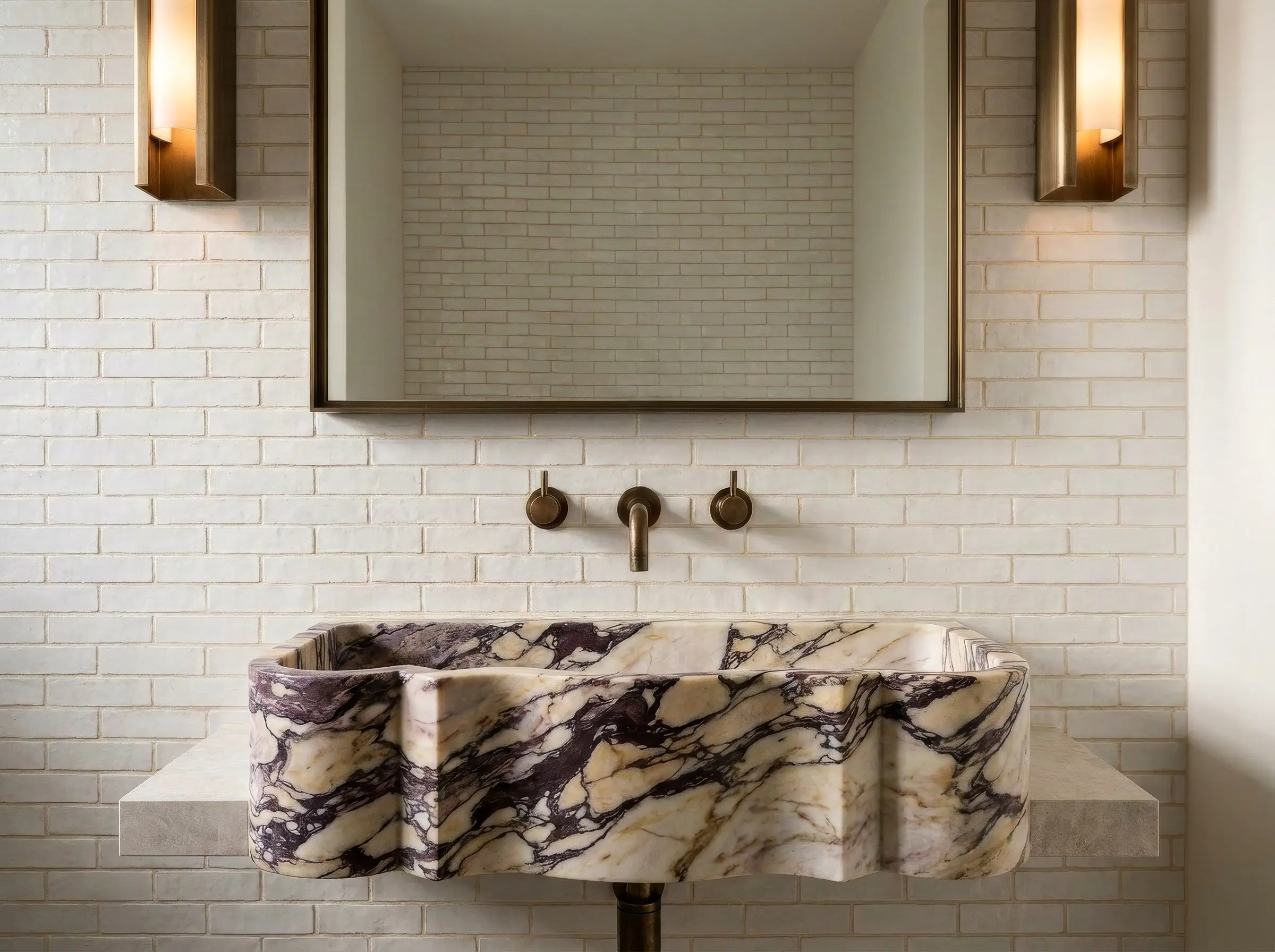
This is the detail that separates a professional-feeling space from an average one: where the tile joints fall. Take a bathroom basin. If the tile joint runs off-centre behind it, the eye catches the imbalance even if it can't say why the space feels slightly wrong. Centre that joint behind the basin, and the whole wall feels resolved - considered, rather than assembled. done at all.
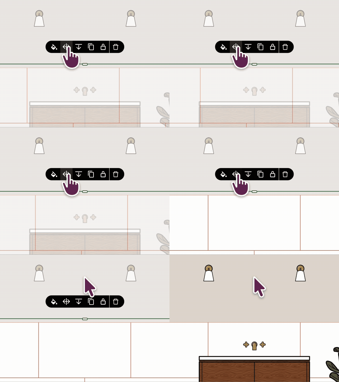
“This has to be planned before tiling starts, not adjusted once the tiler is on site. Once tiling begins from a fixed starting point, moving the layout to centre it around a feature usually means re-cutting tiles that are already set - expensive, and often not done at all.“
Common layout mistakes to avoid:
- Starting the tile layout from a wall edge rather than the room's key focal point
- Leaving cut tiles (thin slivers) at a visible edge instead of at a hidden one
- Not accounting for fixtures - basins, mirrors, niches - until the tiling is already underway

6. How to actually communicate this to your trade
None of the above matters if it isn't communicated clearly. “I like this tile” is a colour choice, not a brief.
A proper tile layout brief should cover:
- Joint position - where the layout starts, and what it should centre on
- Grout colour and width - specified, not left to whatever the tiler has on the van
- Trim approach - matching (invisible) or contrast (deliberate feature)
- Laying direction and pattern - vertical, horizontal, herringbone, brick bond, whatever you've chosen, stated explicitly
This should be planned across the whole area if you plan on tiling adjacent rooms. This approach will enable you to view the resulting cut tiles, making sure you avoid that unsightly cut at your front door that was a result of you telling him you wanted a full tile as you enter the kitchen. Even if you are tiling room by room, set it out across the whole space to make sure it works well in each room, way before the tiler gets his tools out of the van.
Renovating? Read more...
Bathroom
Layout isn't decoration. It's the framework that makes a space feel right.
How Reno helps me translate design instincts into clear, testable plans that clients can actually see and understand.
Interior Designer Lucy McGarr from Homebird Studio
Bathroom
Dimensions and understanding the space needed around your bathroom items
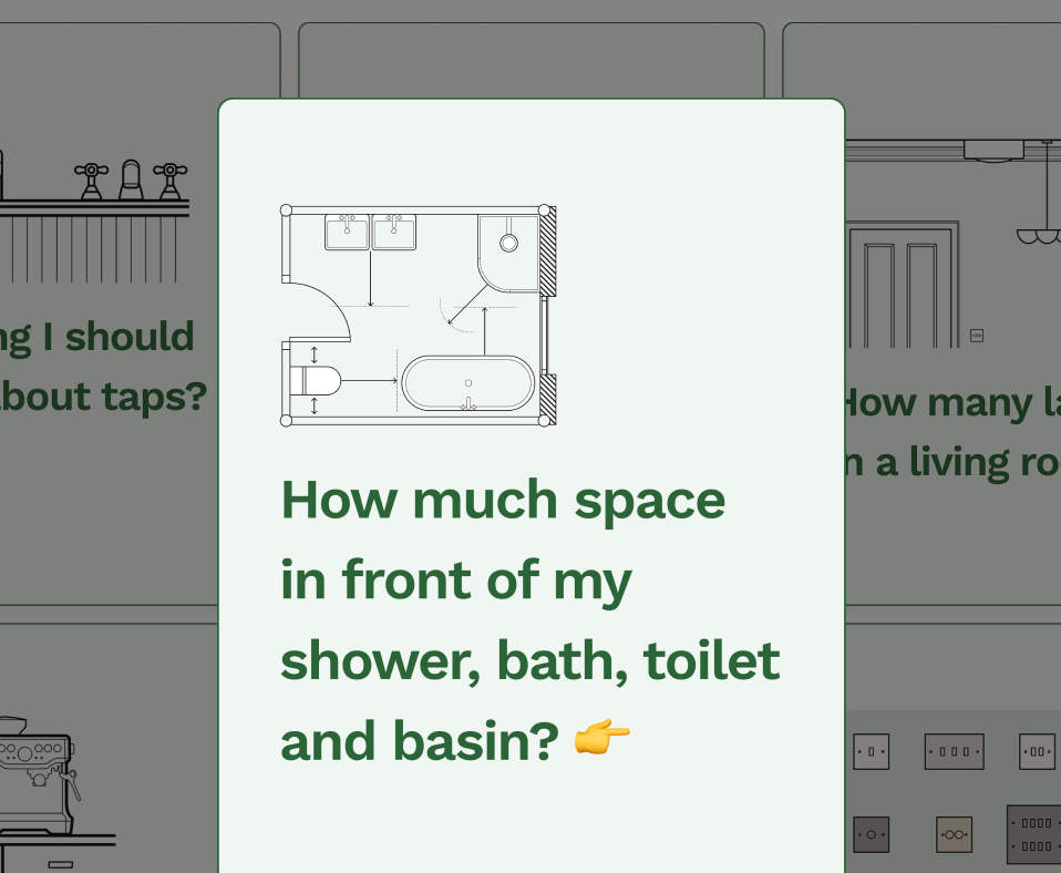
You'll want at least 700mm of clear floor space in front of your basin, toilet, shower, or bath - basically enough room to use them comfortably.
All rooms
How to budget for a home renovation
A practical guide to building a renovation budget from the scope, plan, quantities, quotes and contingency rather than guesswork.
Free tools to get started


Join our mailing list and get 10% off
Who are you? *
By signing up, you are agreeing to our Terms and Privacy Policy including receiving emails from us at Reno (you can unsubscribe at any time). Opted out but want back in? Re-subscribe to the mailing list .
Start your renovation with Reno